


Images courtesy LiLu Interiors
Everyone’s abuzz about Pantone’s pick for 2019 Color of the Year. Living Coral was the choice: a rich, vibrant, yet breezy tone that conjures up white sand beaches, deep blue skies, and azure ocean waves. It also has a midcentury appeal to it. “Bring on the cocktails—and the sun,” this Florida beach-house accent hue seems to say.
 But Pantone isn’t the only game in town. In the worlds of interior design and décor, there are other players. Benjamin Moore and Sherwin Williams also have their picks. “The three colors of the year we pay attention to in the interior design industry are oddly divergent,” says Lisa Peck, principal, LiLu Interiors, and founder/designer of the fabrics, wallcoverings, and rugs company Sylvie & Mira. (Is that just a hint of Living Coral in her popular Leap Rug?)

“Metropolitan Gray from Benjamin Moore is more of a sophisticated neutral,” Peck says of one of the other 2019 color picks. According to Ellen O’Neill of Benjamin Moore & Co., the color “emanates nuance, harmony, and extravagant ease. Always adaptable, it softens to matte or shimmers with sheen. It’s neutral. It’s understated. It just is. This is color, off-duty.
“Sherwin Williams named Cavern Clay its color pick for 2019, a terracotta tone, a subdued earthy color reminiscent of the American Southwest,” Peck continues. In contrast, Pantone’s Living Coral, she adds, “is an outright exuberant color—perhaps a reflection of today’s culture.”
So are we all to run out and purchase new paint? Not necessarily. “Always use colors that suit you,” she says. “If you love coral, snap up accessories and accents while that color is hot. If you love it, you’ll be able to live with it for years.”
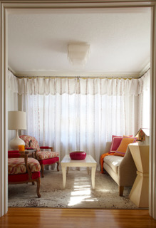
The whites and grays so popular on Instagram these days photograph well, and provide a calm clean palette for living in a chaotic world. The new Metropolitan Gray is nice addition to this trend, but could also “easily be paired with either of this year’s other picks to create a color palette for any room,” Peck says. “Warm grays are a sophisticated gray hue that isn’t cold and distant. I always prefer a warmer gray. Think about the ‘French gray’ crayon in a Crayola box as a perfect shade of gray.”

But don’t be afraid to inject more color. “Think about pairing a vibrant color you love adjacent to others on the color wheel, or with a white or warm neutral. Living Coral could be considered a pink/orange, so you could pair it with similar tones.” For a really energetic space, she adds, “pair the color you love with complementary tones. Cavern Clay could be paired with a teal blue, for example.”


