


2021 Jury
Katelyn Bloomquist || Editor, Midwest Home
Dr. Tasoulla Hadjiyanni || Northrop Professor of Interior Design, University of Minnesota
Mac Plumstead || Design Director, Loll Designs
From an early age, color plays an enormous role in our lives. Research shows that infants as young as 4 months have a preference for certain colors, and that preference continues to influence our identity as we age. We tend to gravitate toward our favorite hues, especially when choosing clothing, home décor, and even vehicles. After all, “What’s your favorite color?” is a common getting-to-know-you question that most of us can easily answer—even if we’re not quite sure why we like that color in particular, we just know that we do.
While most people recognize the basic psychology of color—red equates to confidence and passion, yellow suggests joy and optimism, blue hints at peace and tranquility—many don’t understand how much of an impact it can have on our homes. A study found that Americans spend nearly 90 percent of their time indoors, almost 70 percent of which is at home. And with the threat of COVID-19 continuing to keep many of us inside our homes, it’s more important than ever to create interior spaces that will brighten your day and lift your mood. But while it’s easy to have a few favorite colors, it’s less easy to translate those preferences into your abode—a daunting idea that often leads to homeowners opting for the “safer” neutral shades of beige and white, typically made attractive with the perception of being lower-commitment than a bolder shade.
This is where interior designers come in, armed with years of education and experience balancing colors, patterns, and textures to best reflect their clients’ tastes. This year, we once again partnered with the American Society of Interior Designers’ Minnesota chapter for our annual Life in Color competition, in which nearly 30 ASID-MN designers submitted projects that best displayed their use of color and creativity. The next several pages showcase the six winning projects, which range from a south Minneapolis remodel full of cheerful, perky hues to a serene bedroom suite with soothing blue walls accented by luxe touches of gold and sumptuous textures like silk and velvet. Light green is juxtaposed with black to add a hint of vintage Art Deco to a powder bath, and pale pink cabinets and glossy white surfaces combine to create a stylish office space.
From creating bold statements to subtly enhancing rooms, these projects show that color can be used to truly enrich your daily life—you just have to be open to it.
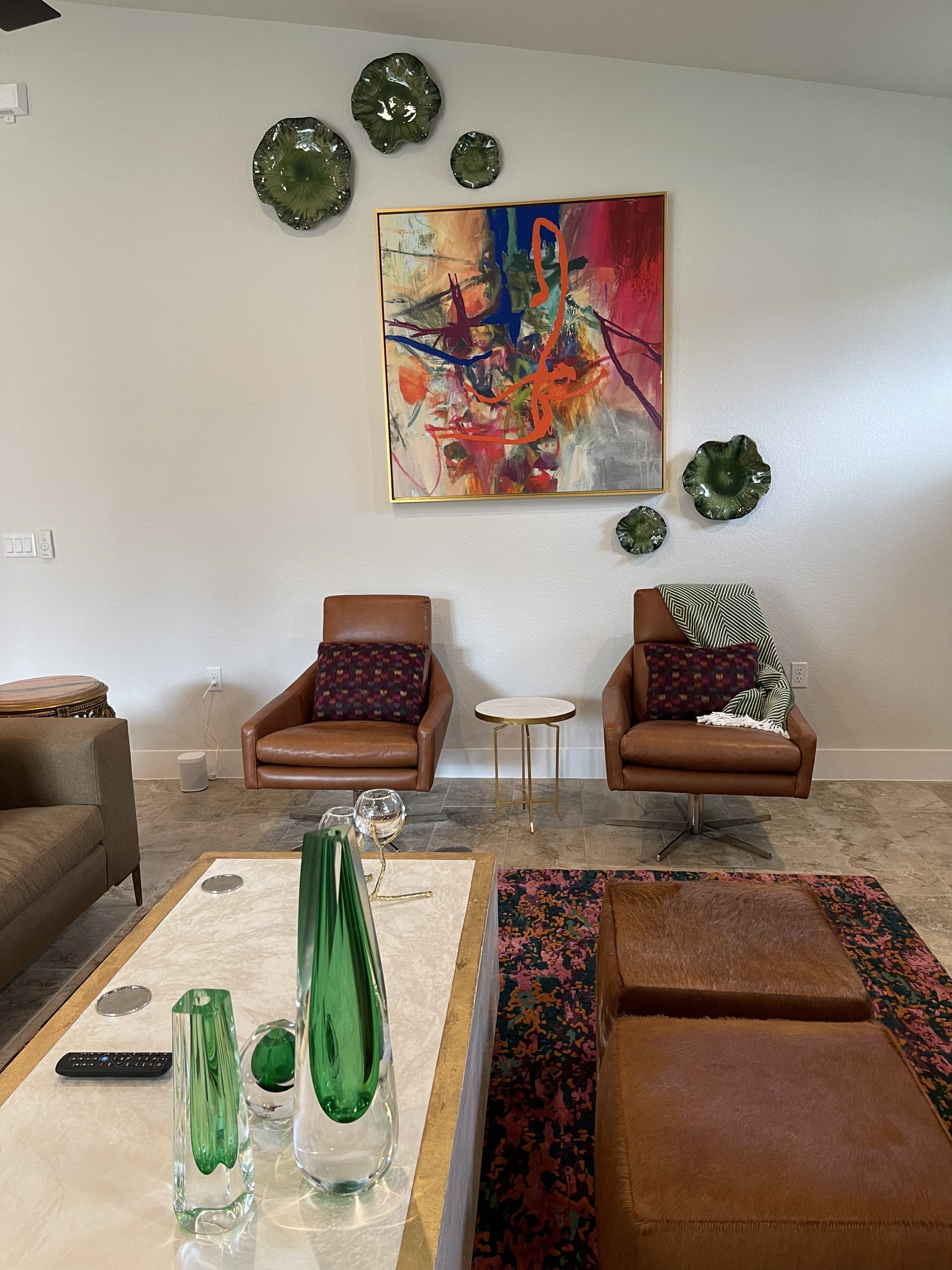
Whimsical Joy

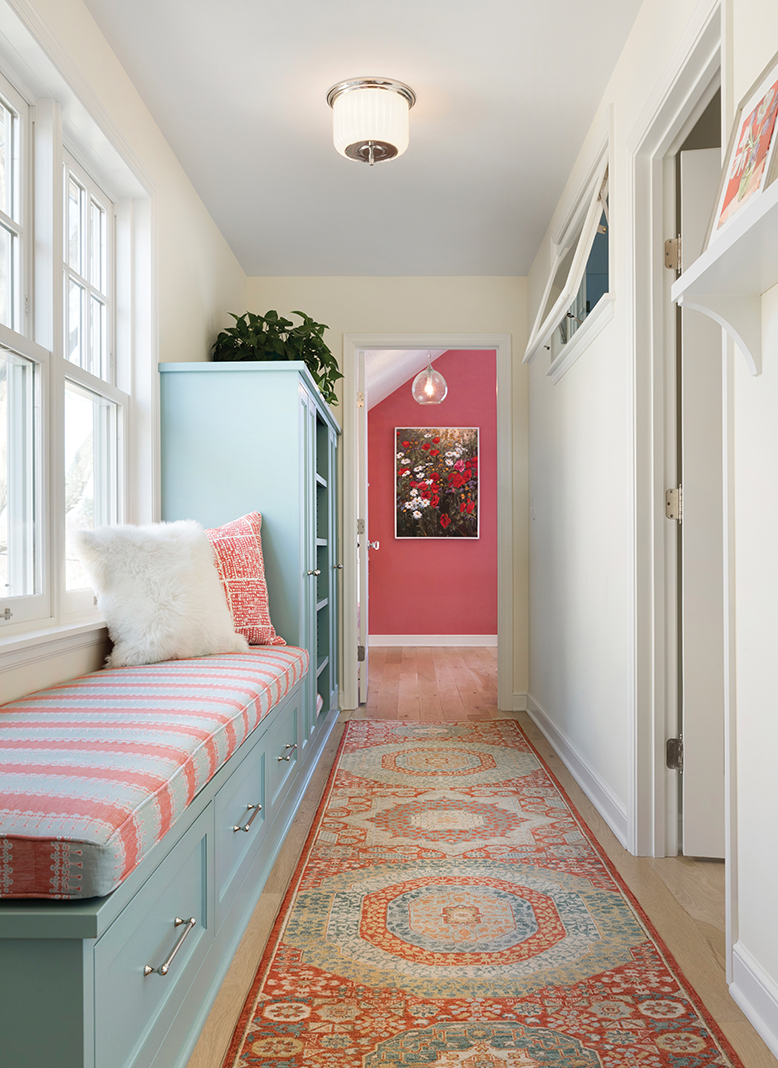

Firm: InUnison Design
Designer: Christine Frisk
The defined and distinct spaces of this adorable south Minneapolis abode were designed to match the clients’ joyful lifestyle. Artful expressions and a bold color palette lend whimsy to the cheerful home, while touches of Scandinavian flair further capture the essence of the homeowners’ unique personalities. “This demonstrates a fearless love of color and material mixing, and I love the bright vibe,” says Plumstead. Bloomquist adds, “This project, in its entirety, embodies what Life in Color is all about.”
Victorian Veranda
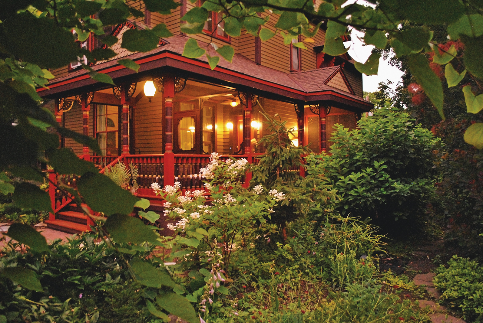


 Firm: Shelter Architecture
Designers: Jackie Millea & Jackie Colpaert
After the homeowner of this 1886 Victorian-style veranda unearthed photos from the 1940s, it was clear this fabulous front porch deserved a historically authentic restoration. Transformed to match the St. Paul home’s original appearance, the veranda now features multicolor posts and brackets that complement its gable design and scalloped details. “A lot of care was taken into the meticulous painting of this porch,” says Hadjiyanni. “It respects and enlivens an essential part of the architecture.”
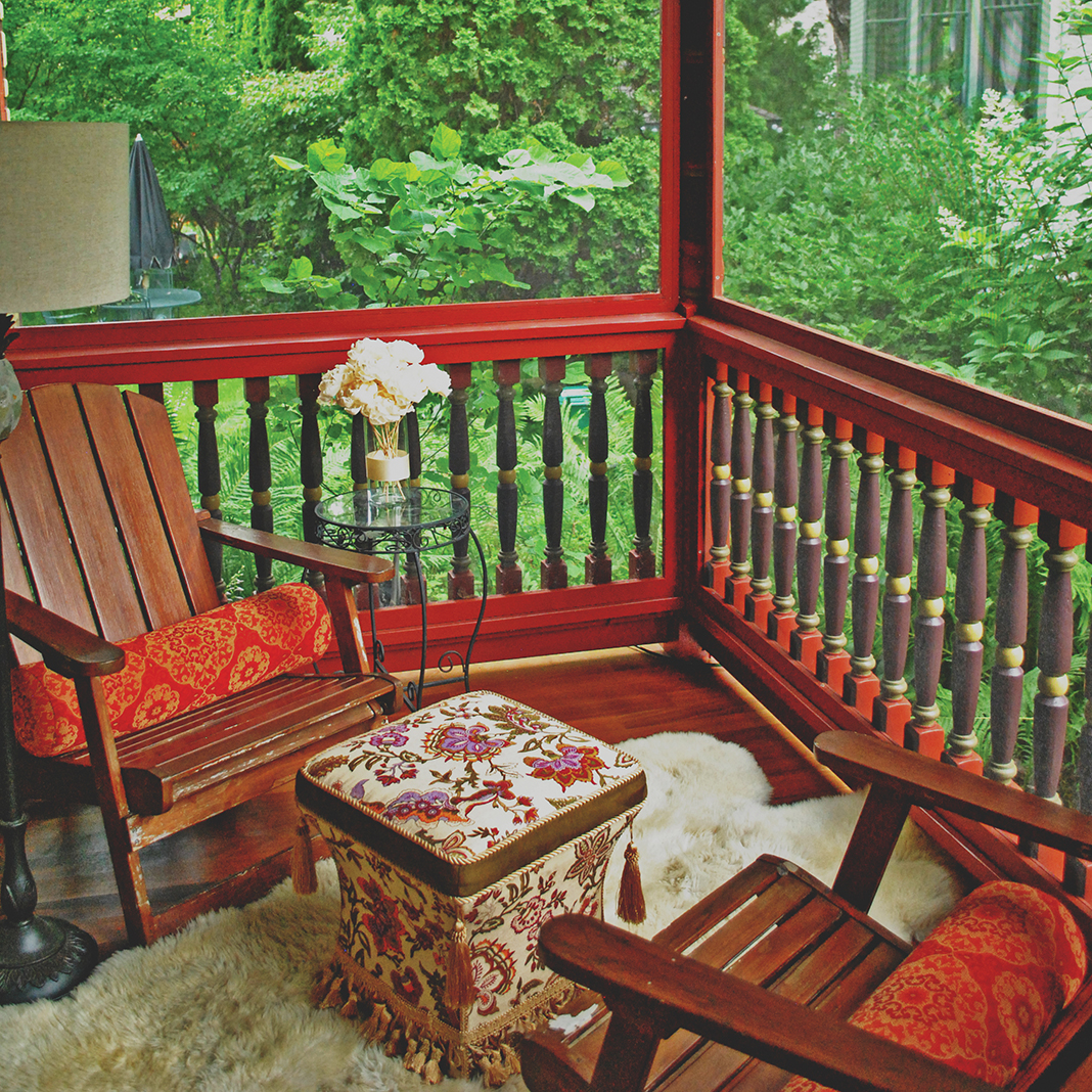
A Night to Remember


Firm: Jodi Gillespie Interior Design
Designers: Jodi Gillespie & Erin Merkl
While prioritizing the architectural integrity of this stately Summit Avenue home, these homeowners turned to their wedding day for design inspiration—selecting a sumptuous silk rug, soothing pink and blue tones reminiscent of their tiered wedding cake, custom draperies, and pink ribbon accents to define their new master bedroom. “The transformation of this space is remarkable,” Plumstead says. “The color palette brings a charming and fresh take on a centuries-old language.
It’s cozy and personal.”
Art Deco Fab
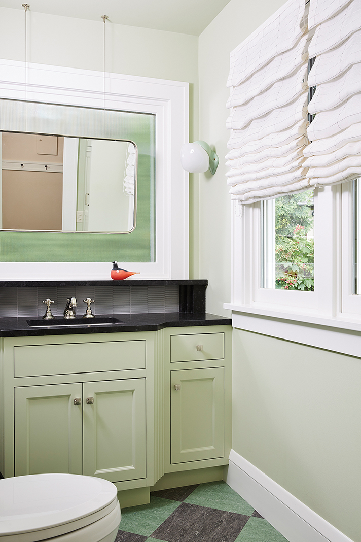


Firm: Daybreak Interiors
Designer: Kristen Mengelkoch
The clients of this powder bath remodel requested a serene space that matched the 1920s era in which their home was built. The patterned floor tiles, salvaged light fixtures, vintage-style plumbing, and black accents all contribute to the room’s period appearance, while an abundance of medium green shades further supports the Art Deco vibe. “The materials involved are beautiful and inventive,” Plumstead says. “I can’t get enough of the mirror hanging in front of the frosted window. Bravo!”
Subtle Serenity


Firm: Martha O’Hara Interiors
Designer: Gabriela Laboy
This home office needed to be more than just a functional space—it also needed to highlight the homeowner’s stylish sensibility with an elegant and modern aesthetic. The solution? Subtle pink cabinets that capitalize on the client’s request: a feminine, sweet, light, and happy escape. The result is a dynamic, understated design that balances a love for color with function and efficiency. “I’m a sucker for pink, and I love a thoughtful monochromatic design,” says Bloomquist. “Who ever said less is more?”
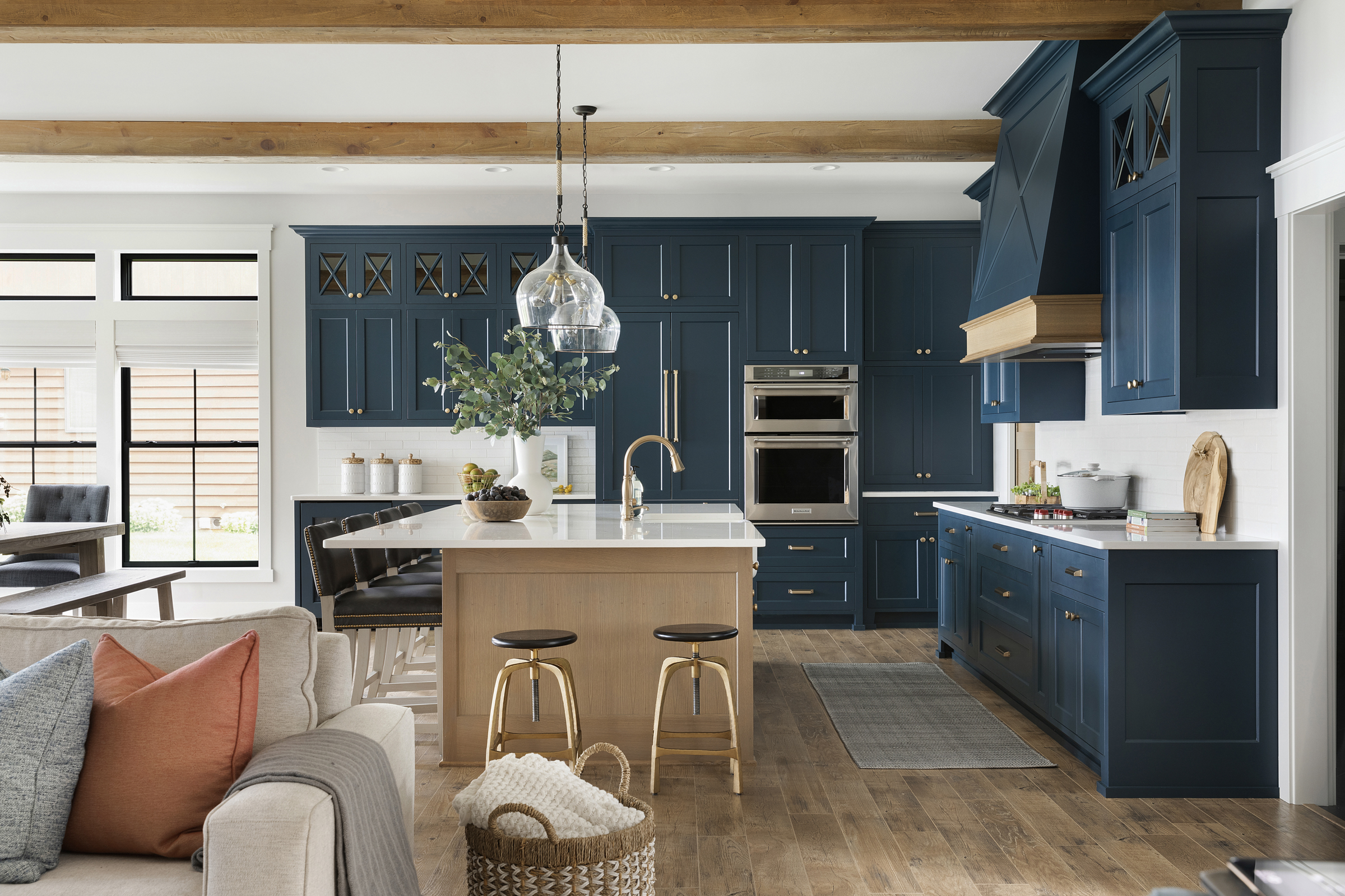
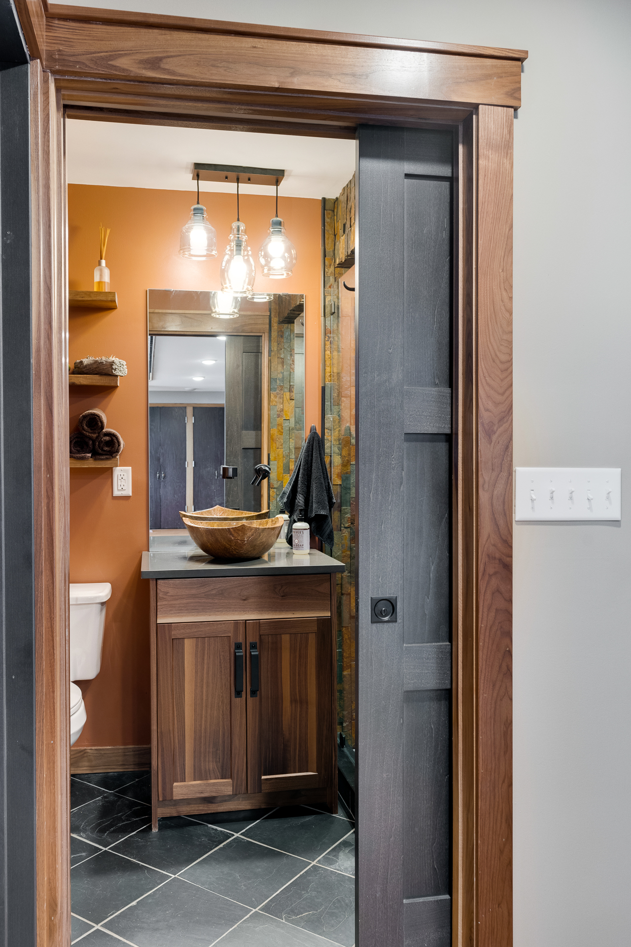
Restful Relaxation


Firm: Fox Interiors
Designer: Colleen Slack
The river views outside this client’s second home were can’t-beat, but the dark, retro kitchen inside needed a big boost. Inspired by nature, the earthy color palette of watery blues, sage greens, and rich chestnut browns makes the space feel welcoming and cohesive—further united by hand-glazed tile, Cambria countertops, and dangling glass pendants. “The light green cabinetry is juxtaposed with beige to accentuate the calming and natural effects of the new kitchen,” Hadjiyanni says.
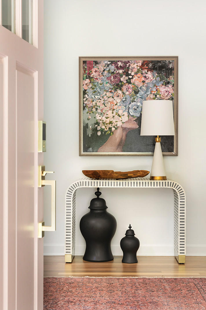
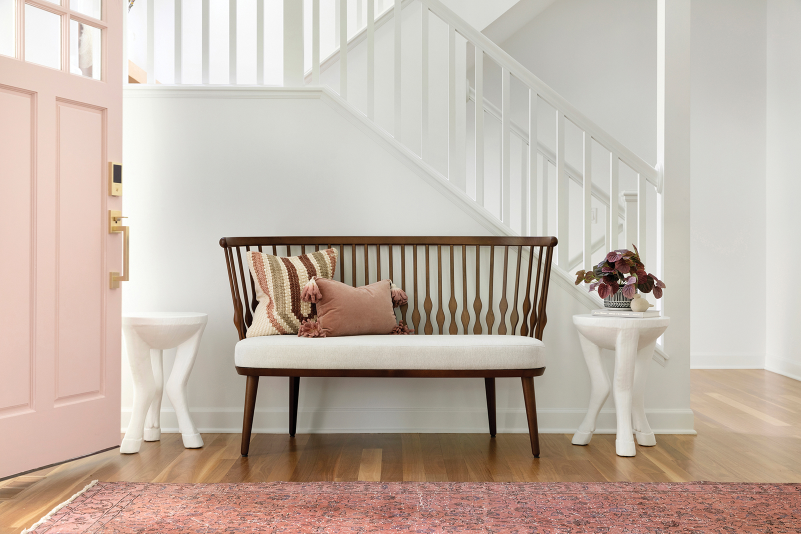
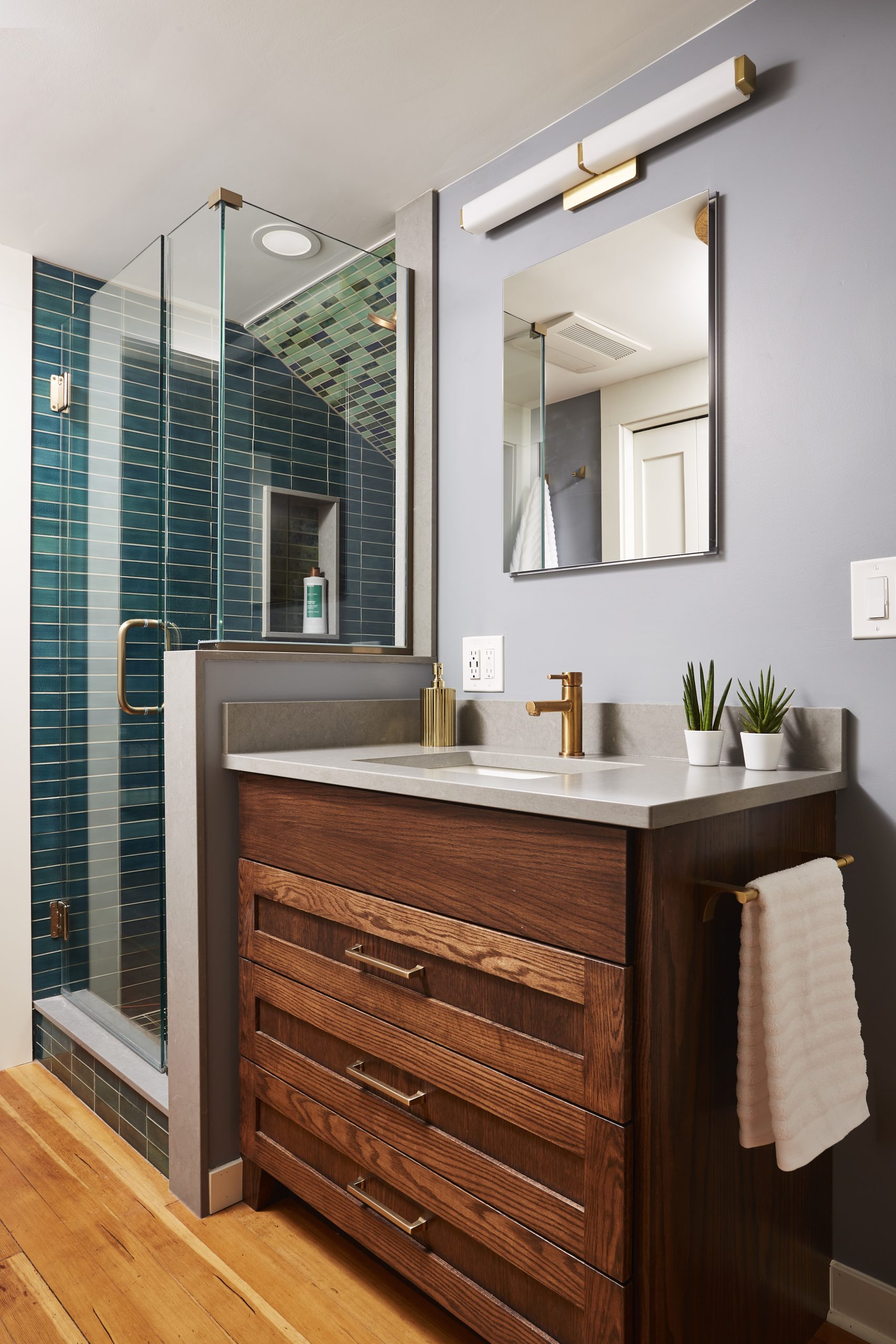
Check out some additional submissions we received in this year’s Life in Color competition below:


