


Photos by Alyssa Lee

When a vacant lot opened up in the Linden Hills neighborhood of Minneapolis, Rehkamp Larson Architects and Reuter Walton Companies were brought on board to design and build a new house specifically meant to fill that particular spot in the community. “It needed to be efficient, stylish, and fit well in the relatively tight block of the neighborhood lot,” explains Mark Larson, co-founder and principal of Rehkamp Larson Architects. “We created a great flowing floor plan perfect for further development, so that when someone bought it, they could really take it and put their own spin on it.”
This is exactly what happened when homeowners Tim and Mekea Duffy moved in. Longtime residents of Linden Hills, the two had settled into their very first home in the charming and historic neighborhood after living in New York City. Toting two toddlers and a baby at the time, they knew they would eventually need more space to accommodate their growing family. Upon finding the home that was being built, the two jumped at the chance to stay in the neighborhood they had grown to love.

“The timing was perfect. The house was framed but not finished when we stepped in and purchased it, so we tweaked the design as much as we could and helped finish it with flooring, paint, and detail. It was much easier than starting from scratch,” says Mekea, who enlisted local interior designer Brooke Voss of Brooke Voss Design to help the couple add in their own aesthetic and style with furnishing and décor.
The home’s sleek, simple architecture, clean lines, and open floor plan naturally spoke to contemporary Scandinavian design vibes, so the couple opted for bleached wood floors and painted the walls, trim, and exterior Benjamin Moore Super White, a brilliant, almost sparkling shade that provided the perfect palette to layer on bold color and texture—elements both Mekea, a self-described “go-big-or-go-home” person when it comes to design, and Voss adore.
“Working with color and patterns is a lot like crafting a perfect recipe: You have to have the right amount of each component so it doesn’t become overpowering or contradicting,” explains Voss. “If you have clean white architecture, it allows you to play with patterns and color in furnishings and accessories. If the architectural envelope becomes more pigmented or strong, some of the furnishings have to recede to make up for it. It’s all about finding the right balance and how you blend it all together.”

The house’s simple exterior gives way to an open, airy space awash in color, with bright hues found everywhere from the rug in the living room—featuring cheerful shades of aqua, orange, rose pink, and spring green—to the playful wallpaper plastered on surfaces throughout the home. While colorful antique playing cards catch the eye in the entry and a hot pink abstract pattern makes an edgy-yet-feminine statement in the mudroom, delicate bird-and-cloud designs create a dreamy ambiance in the kids’ upstairs bedrooms.

“I get lost in wallpaper, especially ones where you have looked at the design 100 times and still manage to find something new or different that you’ve never noticed before,” says Mekea. “I knew when we moved in that I wanted each of the girls’ rooms to have wallpaper on the ceilings, and it turned out perfect because there just happened to be three different color patterns in the same design.”

Voss adds, “What’s really fun about the girls’ rooms is how they all feel completely individual with their bold rugs and colored wallpaper, yet at the same time they have the same level of energy. They each have a rhythm of their own, but that one repeated element of the same wallpaper design creates harmony across all three spaces and doesn’t let the upstairs get too chaotic.”

Rather than tackle the daunting task of fully furnishing the entire house all at once, the design has been carried out room-by-room over the past few years to keep it looking fresh. “Focus on each room and invest in it, adding a piece here and there and layering in a few more elements each year,” says Voss. “That way, the home doesn’t get dated, and as you keep adding and refining the look, it becomes more time-honored and feels more curated and collected.”
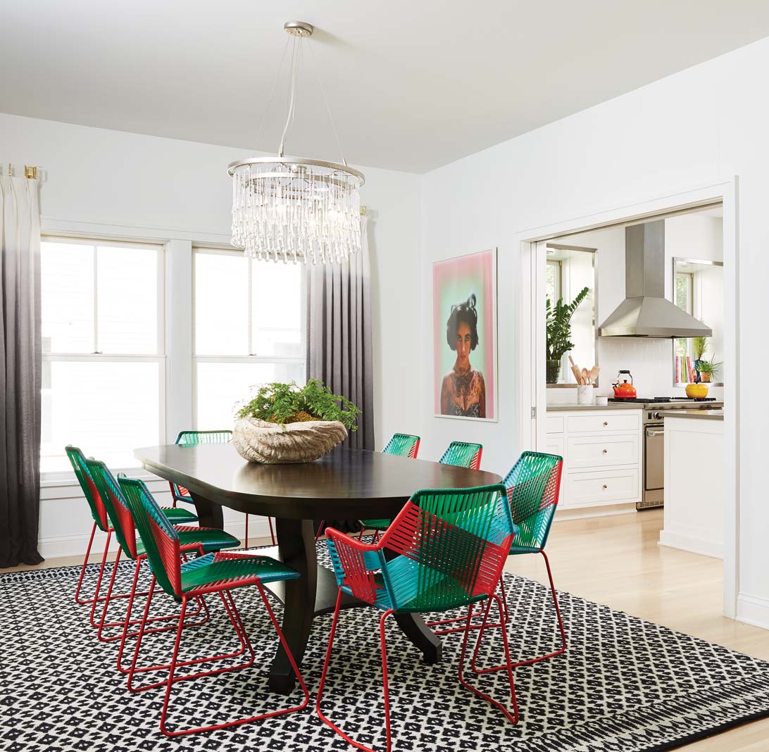
The dining room is a prime example of this careful combination, featuring a traditional-style Bausman & Company table paired with contemporary woven chairs, and a vintage glass display cabinet filled with an assortment of modern dishes. “When you mix old vintage and antiques with brand-new pieces, a tension develops between them that’s really interesting,” explains Voss.

With the open living arrangement of the home where adjoining spaces can be seen through doorframes, finding the right balance for different elements to work together was imperative. One such element was the home’s eclectic mix of modern and traditional lighting, from the Ochre chandelier hanging above the dining table to the funky midcentury-modern one found in the master bedroom. “We definitely wanted a mix of high-low lighting, and we knew you’d be able to see them at the same time so they had to kind of be married together,” says Mekea. “We decided on fixtures before we moved, and got a wonderful combination—the chandelier is more of an investment piece, while the bedroom light is from West Elm and the one in the living room is from a museum art store.”
With some quirky design choices and a liberal splash of color, what started out as a simple predesigned model home turned into a truly custom abode for the Duffys, who plan to continue working with Voss as they feather their nest with new and unique pieces. “It’s really a great example of a house designed to fit many homeowners that was brought to another level through a wonderful first owner who put lots of thought and personality into it,” says Larson.
Anna Bjorlin is managing editor of Midwest Home.


