


Wake Up the Living Room
Photos by Troy Thies 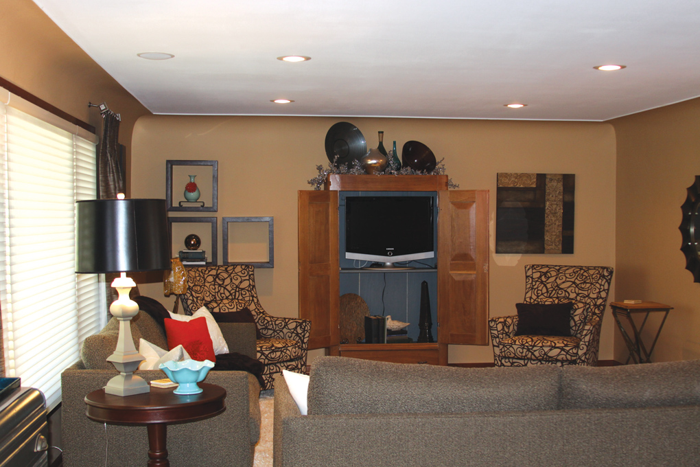
Stylist and stager Jay Nuhring of ReSee Design trusts his intuition when he’s transforming a room (see before photo at right), but he also likes to explain why he makes the choices he does. His aim is to create engagement in observers. He does it with:
1 Color. In this rambler’s underwhelming living room, Nuhring began by painting the warm gold walls a cool neutral (Benjamin Moore’s Swiss Coffee). The original color was too similar in tone to the wood floors, he explains. Contrast in color, tone, and value gives a room definition and impact.
2 Placement. One of the upholstered sofas blocked the entry to the living room—greeting visitors with a sofa’s brown back. Nuhring placed one of them opposite the entrance to make the room feel more open and inviting. He also moved the TV cabinet to an adjacent wall. “It was too small on the [far] wall,” he says. Its new spot offers more pleasing scale and proportion.
3 Artwork. The homeowner knew she needed help with the artwork. Nuhring obliged by looking for pieces with a common thread—a relationship to each other in shape, color, or content—and layed them out on the floor before hanging. Here, the Hans Richter and Calder posters are complementary—“almost as though Calder did a sculpture and Richter painted it,” he says—while the figurative Japanese print picks up the Asian sensibility of the heron print across the room. The thread that connects these works will engage observers, who will find their own interpretation.
4 Pattern. Spread it around—in your rug, accessories, and art. “Don’t put all your pattern into one thing,” advises Nuhring. He replaced the cream shag rug with a flat weave rug with soft forms, added pillows in bright prints, and a hound’s-tooth throw to give the space life. The patterned chairs got custom slipcovers in deep teal. People get nervous about mixing patterns when they consider items side by side, he says. But you don’t see them side by side; when you see them in a larger context—voila, they work!
5 Surprises. Every room should include the unexpected, says Nuhring. Here, accents do the job. The glowing nesting tables next to the sofa, the vintage brass and glass coffee table, the 1950s glass bowl, and 1930s candlesticks add intrigue and glam.
Repurpose a buffet as a handy serving bar.

Add patterned pillows for pop and interest.

Inside Out
Photos by Tim Nehotte, stylist assistants Claire Neviaser and Hannah Segar.
Barbara Schmidt of studiobstyle, inc., is an interior designer, art director, and stylist who frequently creates vignettes for photo shoots. When it comes to her own deck, she knows how to make it an inviting outdoor room for entertaining.
Here’s how she does it: 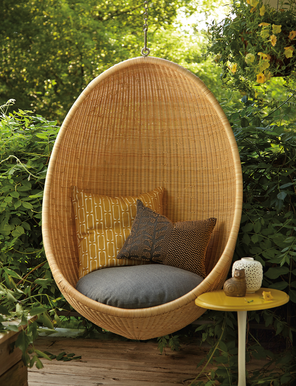
1 Anchor the seating area. The rug defines a “room” so that guests intuitively understand the space. This striped flat-weave rug is tough enough for outdoor events, but must be stored inside when it’s not in use. The planters filled with deciduous bushes create a hedge that also helps set the room apart from the rest of deck. In the fall, the planters are filled with evergreens for the winter.
2 Create seasonal cushion covers. A new durable fabric is the fastest way to update outdoor furniture. This Larson linen and applique design freshens the look of the Brown Jordan Marin Sofa. But you still need to bring in your cushions during rainy weather to keep them mold-free, says Schmidt.
3 Use versatile pieces. The drums do double duty as tables and extra seating. “We keep these black- and gold-painted wood totems indoors and bring them out when extra guests arrive,” says Schmidt.
4 Movable feast. So much easier to load up the bar in the kitchen with ice, glassware, snacks, and refreshments, and then roll it outside! “It’s an instant, portable mini kitchen set up,” she says. “We leave it waiting in the dining room alcove for the next party indoors or out.”
5 Hanging out. Schmidt leaves long, “S-hook” plant hangers in tree branches above the deck and uses them to hang a light pendant or a string of lights, depending on the season. Run an outdoor cord and plug up the tree trunk as a permanent source of electricity, she suggests. For added seating in a tight corner under the eave, try a hanging chair. “We were able to create a secondary seating area nestled into the wisteria for privacy,” she says. “It’s the perfect spot for a quiet moment reading or sipping your morning coffee.”
Above: Hang a chair from an eave to create a relaxing, private space.

Finishing Touches
Photos by Troy Thies
The color-loving owners of this Edina home asked Kirsten Hollister and Katy Wardwell, interior designers with Historic Studio, to blend its traditional architecture with a colorful palette. Their mission well underway, the two styled living-room accessories for their traditional-with-a twist redesign. They framed their accessory choices with a medley of items that are timeless, timely, and timeworn. Their approach:
1 Determine function. This living room bookcase, enameled in a custom mix of Benjamin Moore’s Navaho White, displays mementos and items important to the homeowners, telling the family’s story more than it functions as a bookcase. “Function first,” says Hollister. “If this was an office or library, where the function was more about the books, then you would see more books.”
2 Shop the house. The designers gathered photos and other accessories scattered about the house. Always start with items that are in your home—those are the timeless things, says Hollister, adding: “You don’t just want to have a bunch of stuff. You want things that are meaningful to you.” 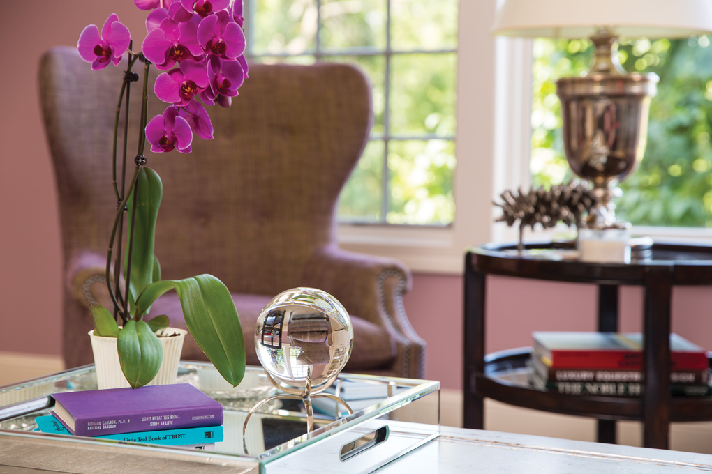
Right: The mirrored tray on the coffee table corrals remotes and protects the table from spills. Fresh flowers always add a welcome touch.
3 Find a theme. When the designers looked at the items they’d gathered together, themes began to emerge, says Wardwell. Bringing in the family photos—all framed in silver and purple—provided a unifying thread, as did the homeowners’ other colorful pieces. They pulled in the small painting from the nearby office because it highlighted the palette of the living room.
4 Additions. The designers also added new pieces that would resonate with the homeowners. The bright urn on the top shelf and boxes on the bottom are balanced by the crystal vases that provide sparkle and visual relief. The bird figure on the top shelf and the bird-decorated ceramic vases add a naturalistic theme. Repeating motifs is also pleasing to the eye.
5 Color. These homeowners clearly love color, so their shelves were loaded with it. “That typically happens when you have something you love: If you love color, that’s what you gravitate toward,” says Hollister. But the original effect was a bit too bright and hot,” she says. “It’s all about balancing their love of color so it doesn’t feel overwhelming.” Different shades of purple and layers of black and white now create a more coherent color story.
By Chris Lee Stager: Jay Nuhring, ReSee Design; Stylist: Barbara Schmidt, studiobstyle; Interior Designers: Kirsten Hollister and Katy Wardwell, Historic Studio


