


Photo by Chad Holder
2020 Jury
Jen Biswas, Nov/Dec 2018 Stylemaker; Owner, Paisley + Sparrow
Katelyn Bloomquist, Editor, Midwest Home
Paul Buttenhoff, May/June 2019 Stylemaker; Professor, St. Catherine University
I believe there’s something to be said about making a statement—boldly, confidently—in our personal lives, professional careers, and even with the colors we choose to adorn our walls. Opting for neutrals (where one can pull in pops of color as trends come and go) is easy, but giving an interior designer the latitude to add a shocking shade of scarlet to your kitchen is much harder to swallow.
The designers featured in our 2020 Life in Color competition are responsible for more than making a space appear color-coordinated, though. A room needs to feel right. And although size, orientation, lighting, and more can influence this, it’s often the color palette that defines what’s fab and what’s flat—largely due to the ever-present physiological effects of different hues. Blues relax, yellows invigorate, reds excite, and interior designers (well-versed in color theory and psychology) know it. They study it. They live it. The competition searches for local designers who have mastered this art, and we found the best of the best within the American Society of Interior Designers’ Minnesota chapter.
Within the award-winning projects on the following pages, designers successfully incorporated color in creative and innovative ways. This year’s jury honored a serene gray-blue shade that evokes a timeless, harmonious vibe; a radiant red hue that emits an infectious energy (the red Arne Jacobsen Egg chair on the next page will have you swooning over its simplicity, too); and an optimistic orange that awakens the soul with a cheerful vigor and catches the eye. From olive and emerald to Kelly and shamrock, green’s rising popularity is also impossible to ignore. In vibrant shades, the color flaunts an effortlessly cool energy, while more muted selections instill a feeling of tranquility. Although different in the best ways, these six projects all showcase what it means to make a bold statement in your home.
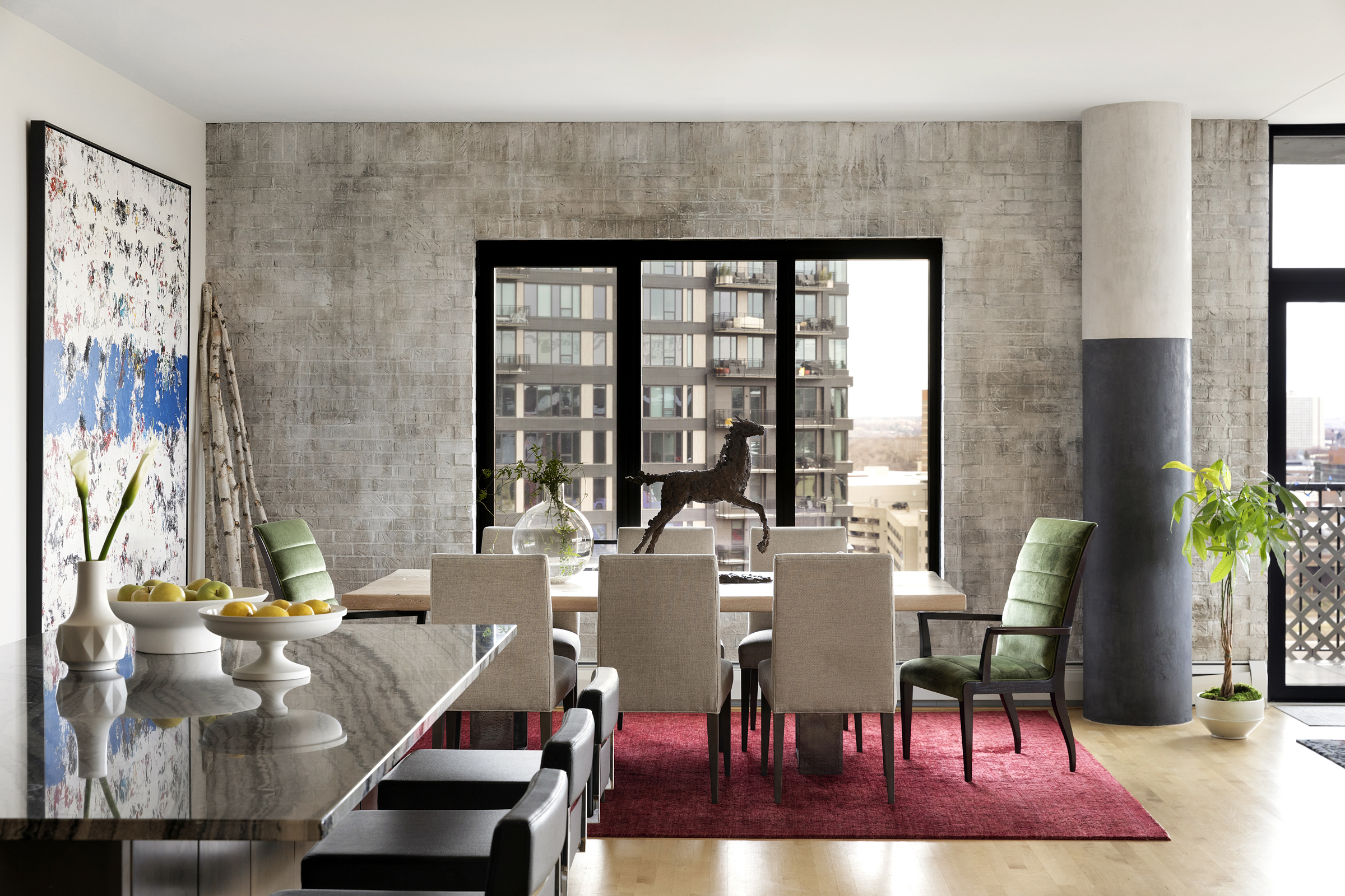
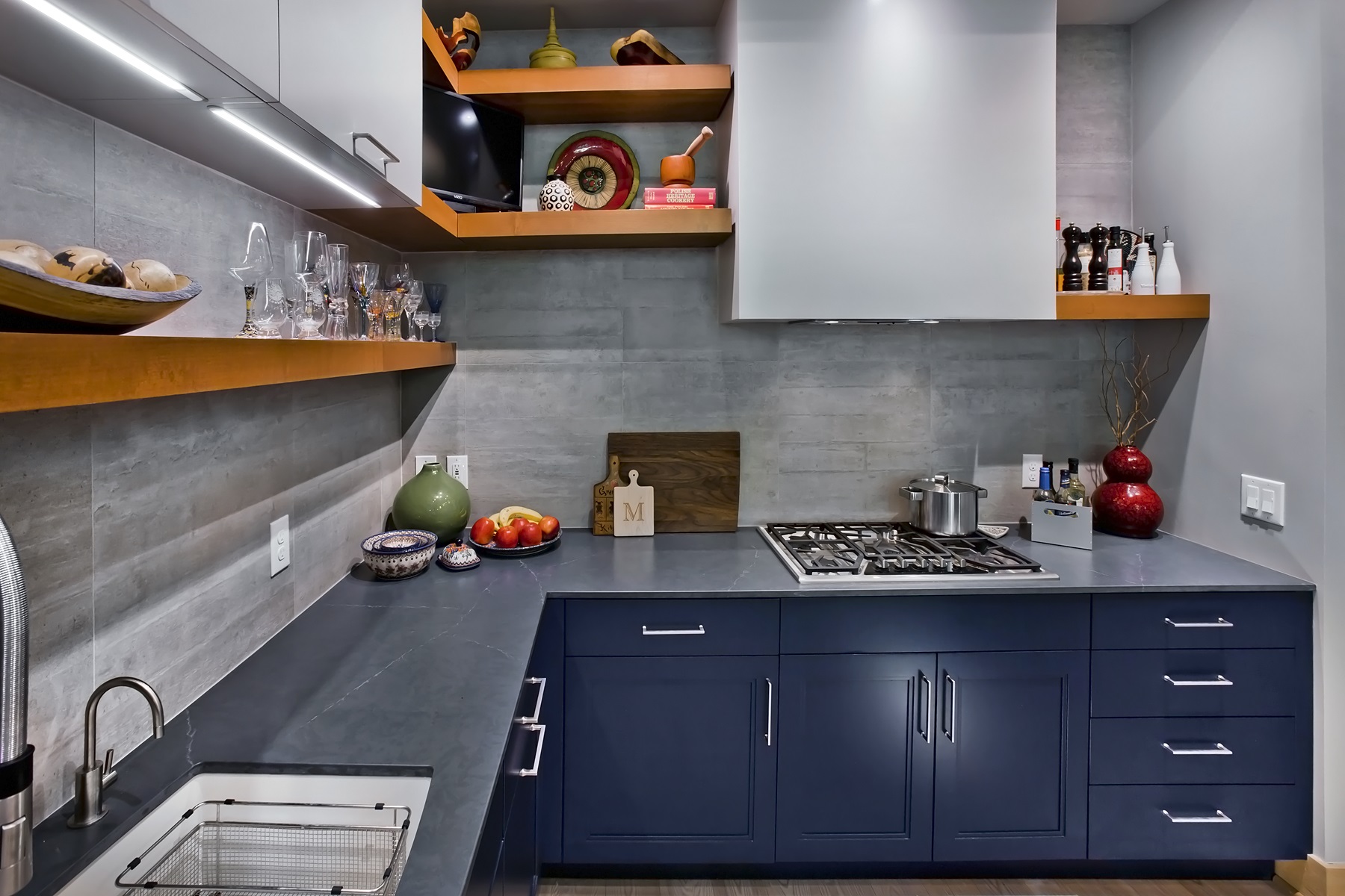
Pops of Pizzazz
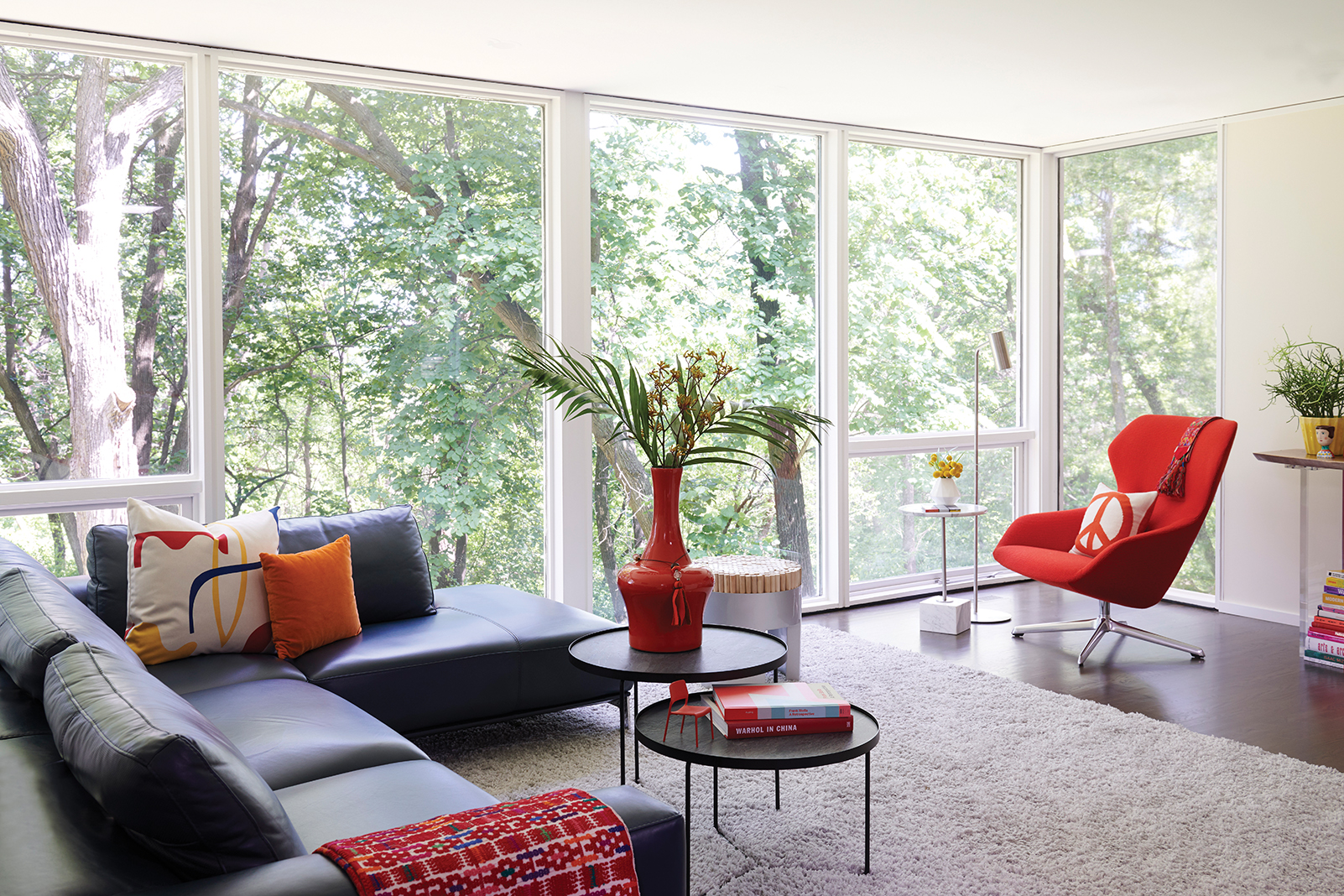


Firm: Lucy Interior Design
Designers: Lucy Penfield & Stephanie Lalley
Although the client’s modern art collection inspired this collaboration’s color palette, creating a gathering place to relax and have fun was an equally important goal. Full of organic shapes that balance the graphic paintings, this gallery-reminiscent gem is filled to the brim with color: A red Arne Jacobsen Egg chair complements the nearby art’s geometry; orange pillows and rugs add a hint of optimism; and a purple velvet settee pulls in pizzazz. “I never thought these colors could come together so cohesively, but the designers most certainly pulled it off,” Bloomquist says. “Color me impressed.”
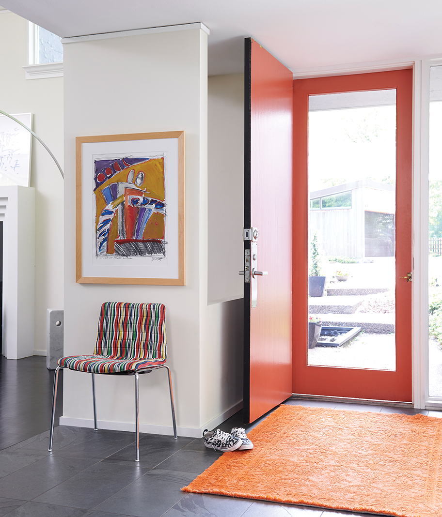
Perfectly Playful


Firm: LiLu Interiors
Designers: Lisa Peck and Christina Rymer
A happy home full of color, pattern, texture, and durability was at the top of the list for the clients of this newly purchased Prairie-style home. The ’60s-era superheroes that adorn the office walls add a unique touch of playfulness, while lively shades of pink, graphic floral designs, abstract prints, orange accents, and multi-colored furnishings embody what Life in Color is all about. In fact, “inspiring” was the word Buttenhoff used to describe the impressive scope and scale of this family-focused project. “[The designers’] excellent management of so many elements created the perfect vibe,” he adds.
Vintage Whimsy
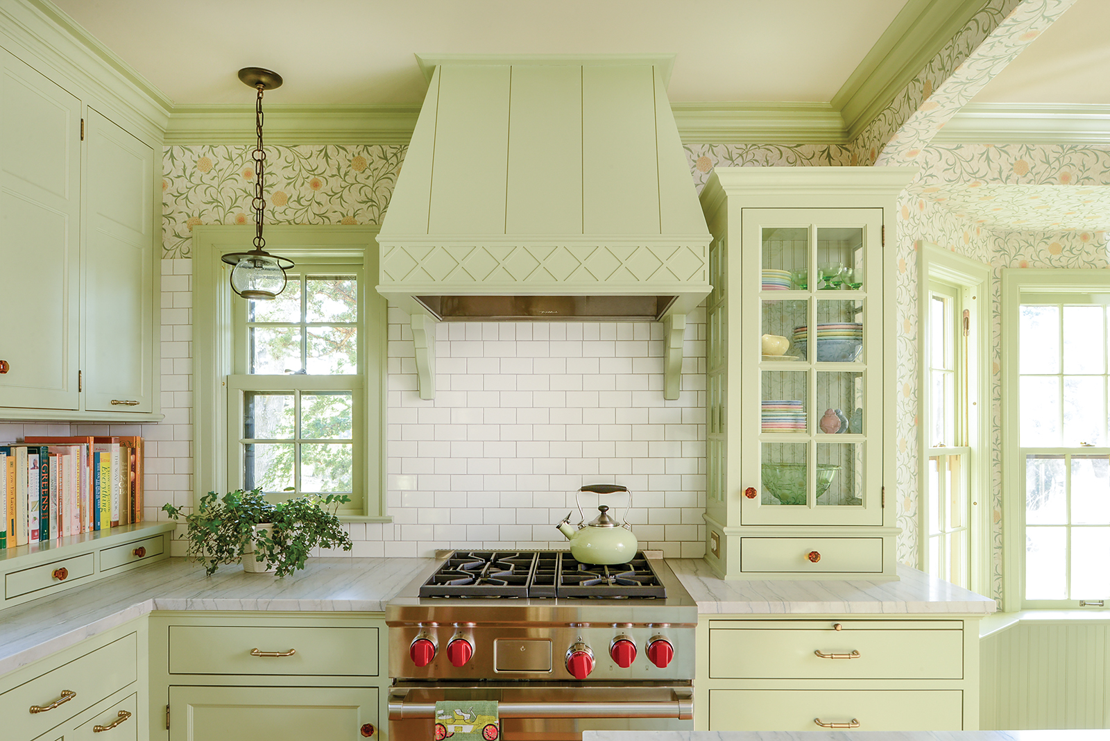
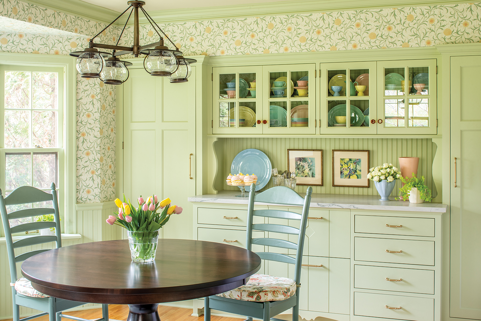

Firm: David Heide Design Studio
Designers: David Heide and Chris Christofferson
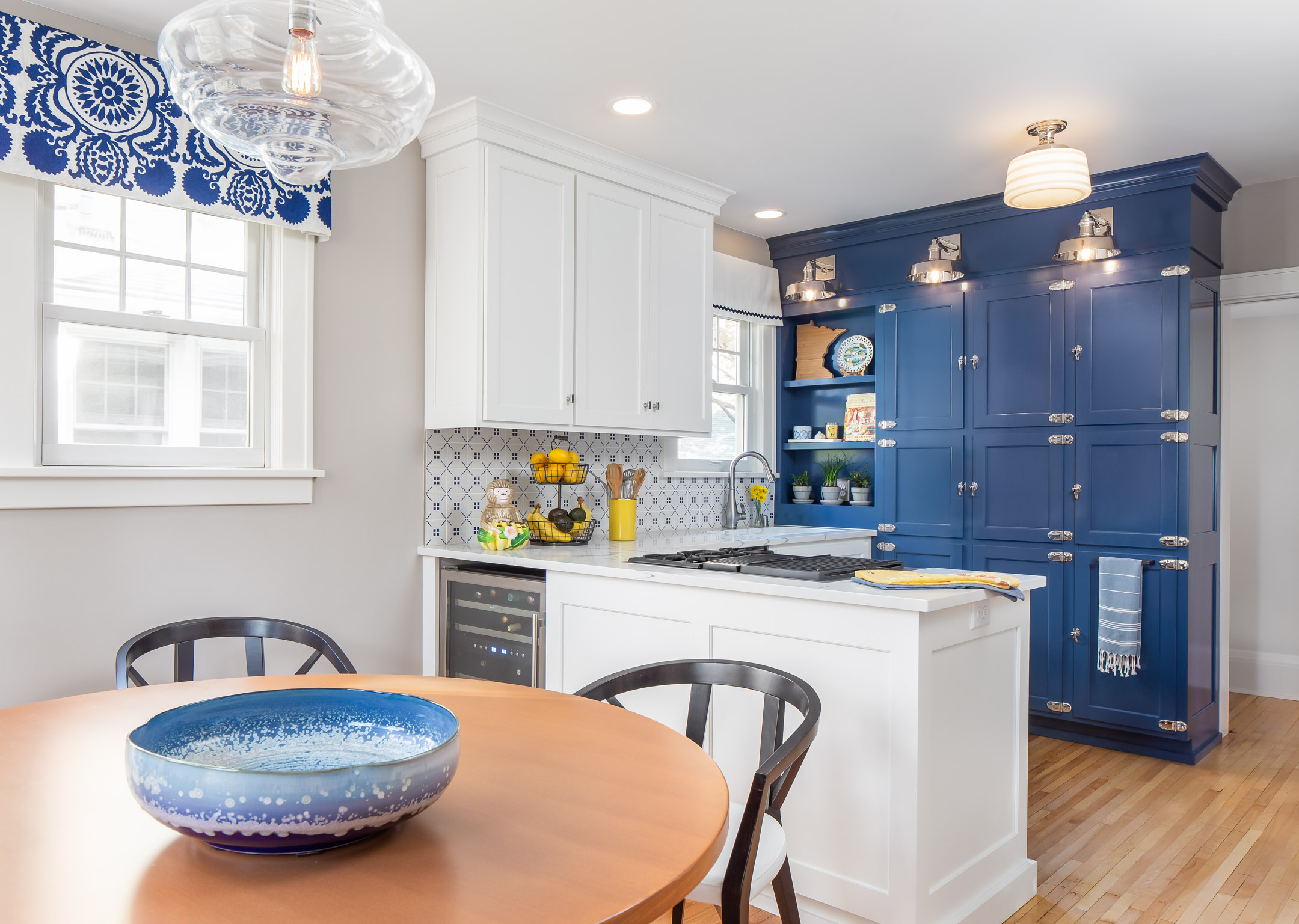
When a prominent pastel green (chosen for its popularity 80 years ago) is combined with supporting details like amber crystal knobs, a lively wallpaper, and glass-fronted cabinetry, a cheerful cottage comes to life. Inspired by vintage kitchens in the ’30s and ’40s, the paint color was designed to be the star of the space—second only to honoring the childhood kitchen built by the client’s father. “It takes courage to make a color like this the backbone of your design,” Bloomquist says. “I’ve never seen such a unique green used in this scope before—let alone this successfully.”
Bold & Beautiful


Firm: Studio M Interiors
Designer: Lori Handberg and team
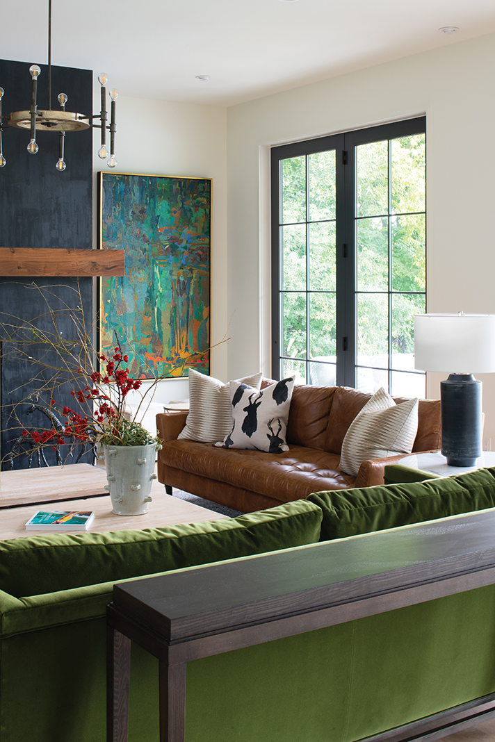
The client of this family home specifically requested color, which opened a world of bold options for the designer to explore. Thanks to an overflowing Pinterest board of ideas, a modern mix of materials (including plush velvet, supple leather, marble, driftwood, distressed wood, and chunky wool) could come together to create visual interest. The designer paired the materials with a curated blend of warm and cool colors that now reflects the family’s style and allows their personalities to shine. Buttenhoff describes the project as “an excellent, seemingly effortless, orchestration of tone and texture.”
Green & Serene


Firm: Prospect Refuge Studio
Designer: Victoria Sass
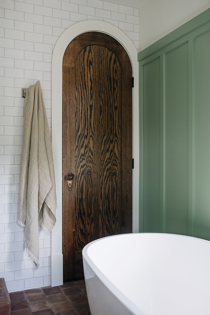
When designing this turn-of-the-century bungalow, maintaining its architectural history was of utmost importance for all parties involved. Although the hardware and a good portion of the trim are original to the Lake of the Isles home, the master bath’s cheerful new green complements its custom arched oak doors, heated terracotta tile floors, dovetailed vanity drawers, and sentimental family heirlooms. “The gorgeous green gives this space a serene feel,” Biswas says. “The vanity is stunning, and I love how much character was preserved.”
Thoughtful Elegance


Firm: Bruce Kading Interior Design
Designer: Bruce Kading
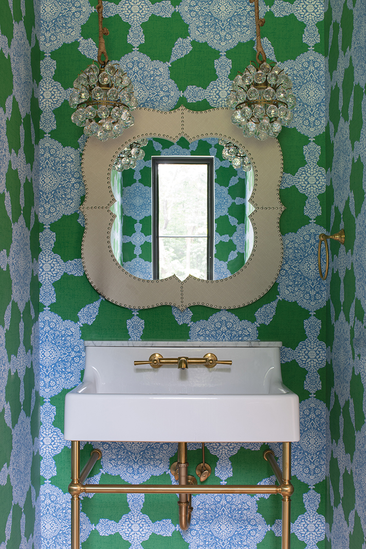
The goal: Restore this historic 1855 New York brownstone beauty to its original glory while infusing it with comfort and modern functionality. An elegant Victorian-inspired palette of ivory, spa blue, gold, and platinum for the walls, draperies, and upholstered furnishings allow the red-and-blue Persian rug, antique chandeliers, sconces, brass pilasters, and period architectural details to take center stage and evoke a harmonious sense of calm that spans centuries. “This space has such a timeless feel without the heavy hand of a traditional palette,” Buttenhoff says.
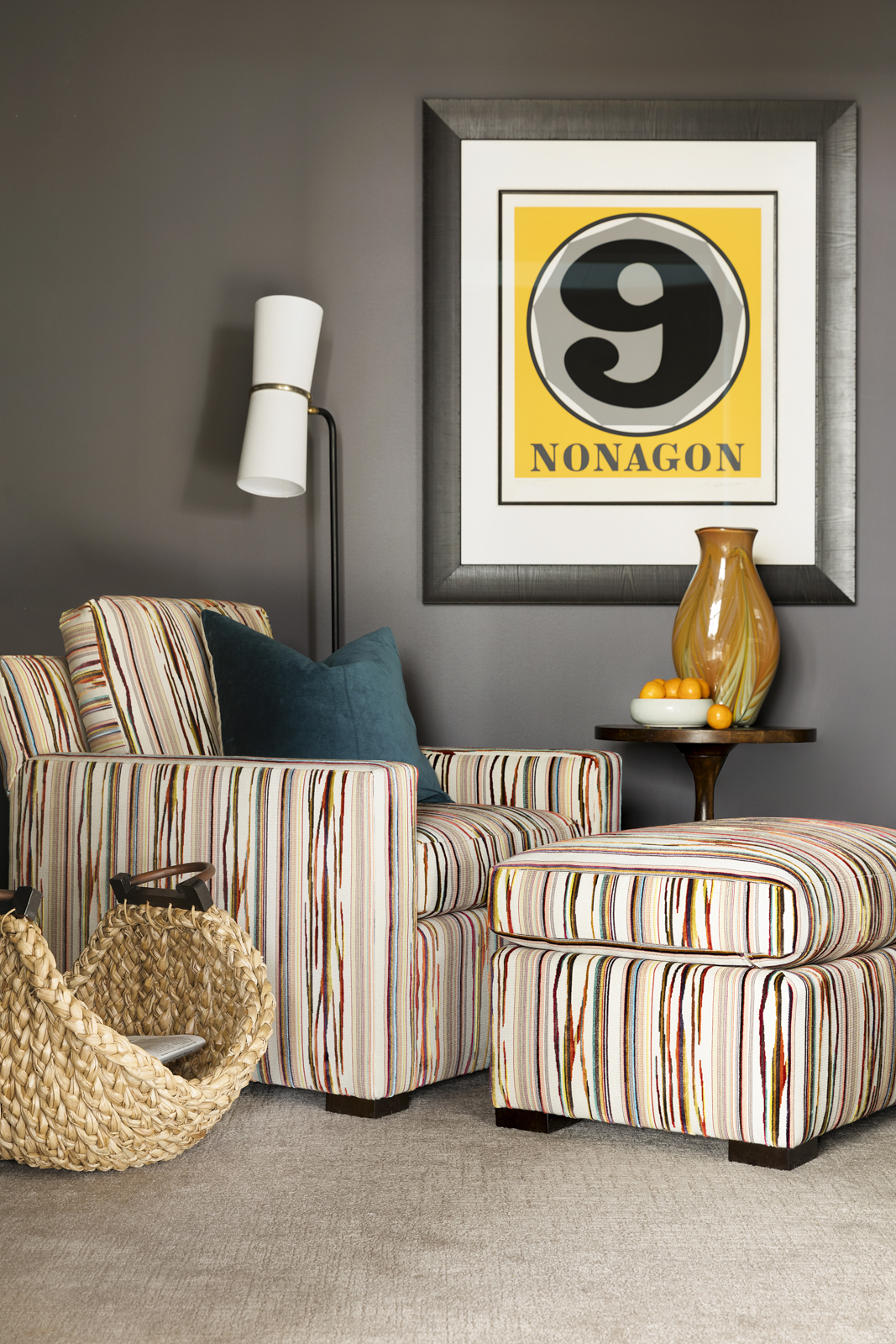
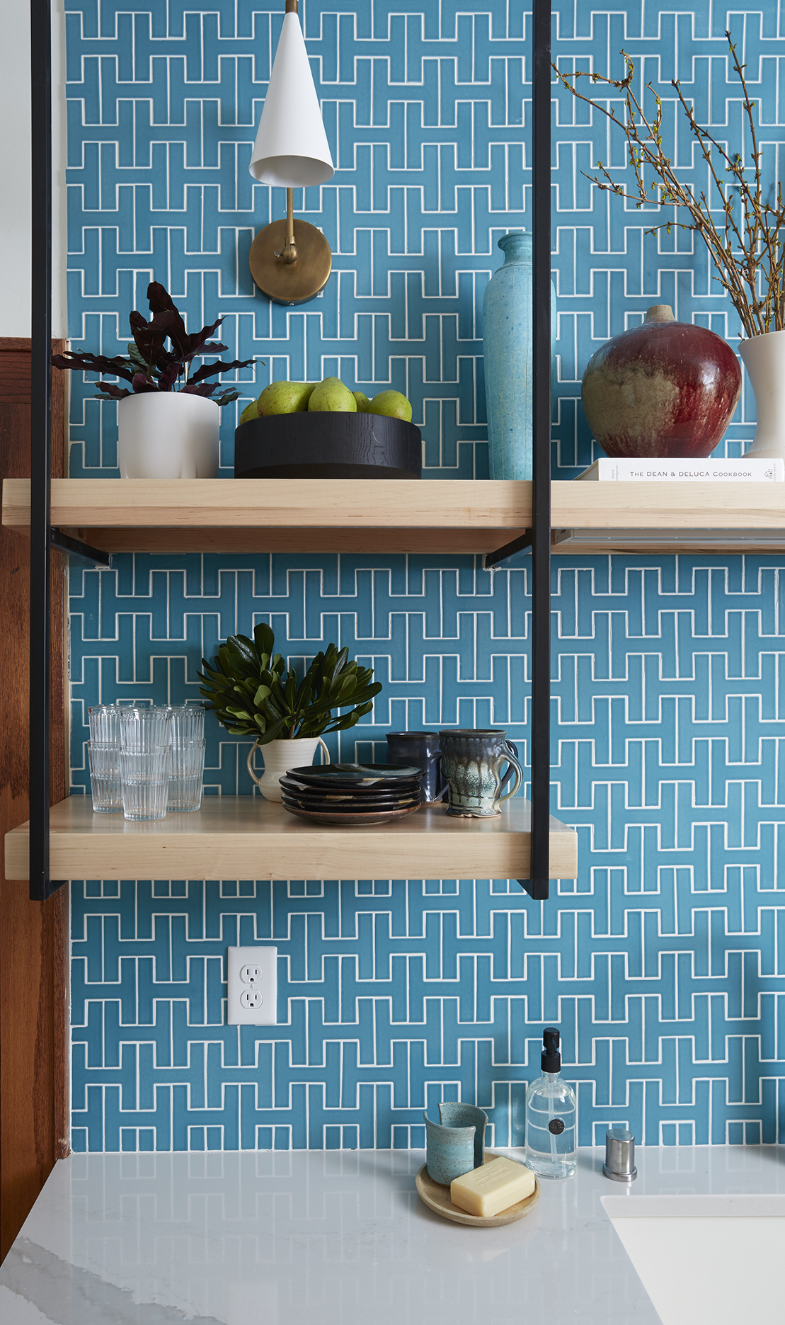
Check out some additional submissions we received in this year’s Life in Color competition below:


 of a colorful design competition.)