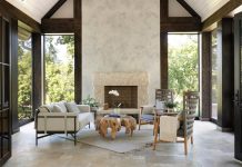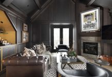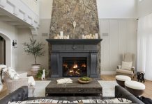
This homeowner wanted her new home to be vibrant, bold, and fun. Designer Brooke Voss and Rehkamp Larson obliged with this colorful, but sophisticated, space.
It’s all around us. It affects us every day, both psychologically and physiologically. Color, created by reflected light and the way we perceive it, is powerful: neutrals calm; brights stimulate; and pastels soothe. It evokes strong emotions. No wonder most of us have strong opinions about color—check out the commentary on Pantone’s Color of the Year each December if you have any doubt.
Even so, we often stumble when it comes to selecting colors for home and home décor—perhaps because color is as much a psychological choice as an aesthetic one. The default for many: neutrals, white, beige, greige, or gray. Nothing inherently wrong with those choices, unless we opt for little color because we’re afraid to commit to bolder, brighter tones.
That’s why we called on ASID MN interior designers to show us their colors, entering their most vibrant projects for this year’s Life in Bold Color competition, sponsored by Hirshfield’s. Interior designers, well-versed in color theory, understand how to use color to create the mood their clients want.
Consider red, for example, the color of passion, danger, and strength. It’s bold, warm, exciting, and stimulating. Several of the winning projects included shades of red in their color schemes. Just consider the wake-you-up potential of a red bathroom!
Another warm color, sunny yellow, says summer, happiness, and optimism. Used judiciously, yellow imbues a space with cheer and friendliness—like the pantry off the bright blue and white kitchen designed by Martha O’Hara Interiors. Even a small touch of marigold, lemon, or gold will give a room a lift.
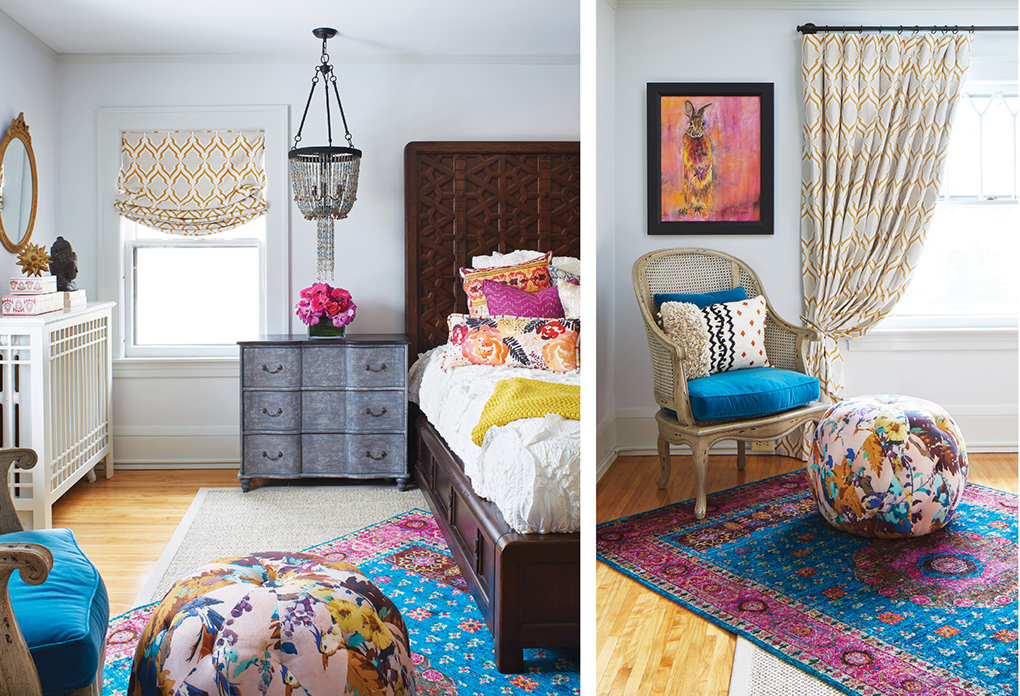
Tranquil and soothing, blue is often the go-to color for bedrooms. Both winning bedroom projects feature shades of blue with warm accents—restful, but with skillfully balanced color, pattern, and texture.
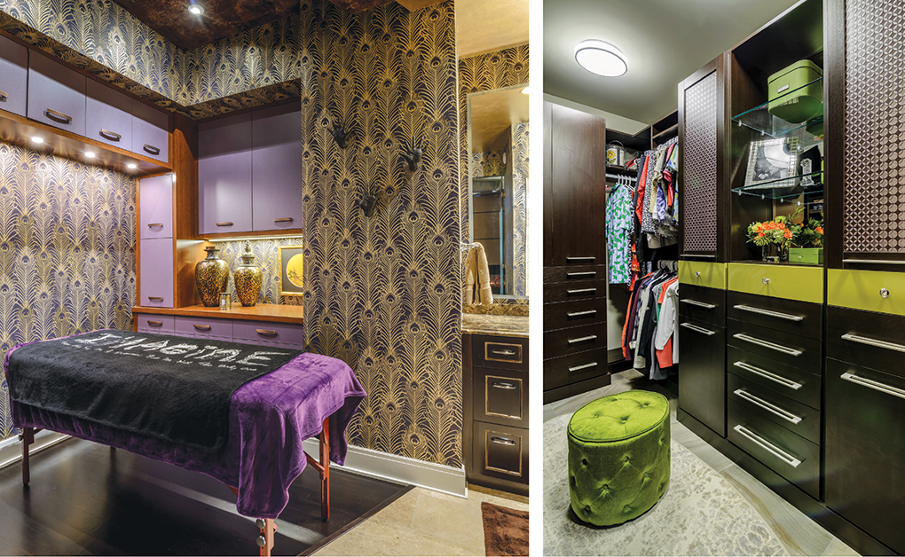
Green, the color of nature, also tends toward cool—though not so much when mixed with yellow to produce chartreuse. That versatile color can move even warmer—check out the kitchen cabinets that nearly pop off the wall to the left. A chartreuse with more green is still eye-catching: See the apple-green of the chair on Pure Design Environments’ project.
For the Life in Bold Color competition, the jury evaluated entries based on how well the design solution met the project’s goals, the designer’s innovative and creative use of color, and the designer’s demonstrated master of color theory/psychology.
2017 JURY
Caren Martin, Ph.D.
Associate Professor,
University of Minnesota
Principal, Martin & Guerin
Design Research, LLC
Principal, InformeDesign, LLC
Patricia Undlin, ASID
Senior Interior Designer, Pappas Design
Winner of 2016 Tom
Gunkelman Legacy Award
Chris Lee
Editor, Midwest Home
magazine

Keen on Color: Brooke Voss Design
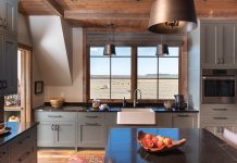
These clients knew they wanted their space to feel vibrant, bold, lively, fresh, and fun—but needed guidance on what colors to add, how to incorporate them, and in what dosage. The designer and architectural team obliged. They jumped in headfirst with chartreuse, bright blue, and teal, balanced with neutrals like fresh white, honed black, and natural wood to create a bright, cheery space without being juvenile. The design team designed the kitchen cabinetry with powerful colors in mind (see previous spread), surrounding them with a neutralizing true white and an edgy, matte black for balance.

Brooke Voss • brookevossdesign.com
Photo by Corey Gaffer

Good Energy: Orfield Design & Construction, Inc.
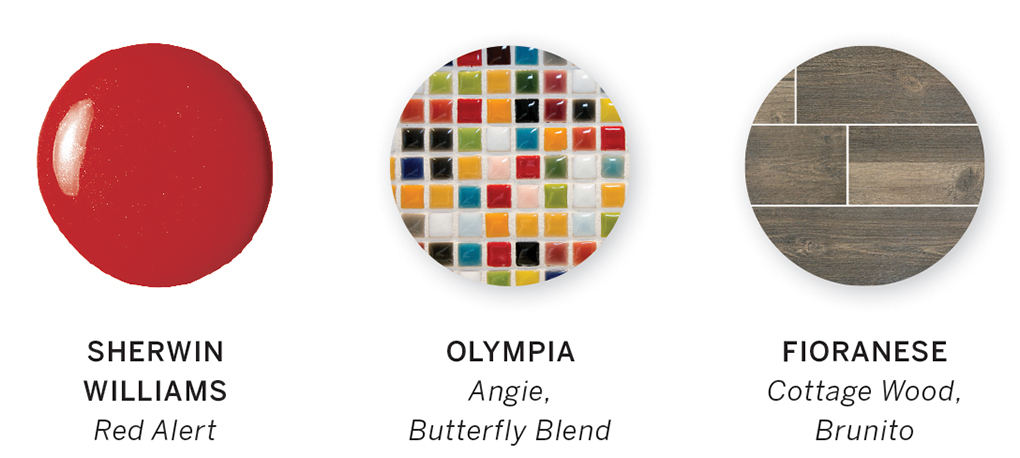
The empty-nester owners of a midcentury modern rambler decided they wanted a fun and functional bathroom for their guests and grandkids. Everything stayed in place, but the finishes turned up the heat. Walls painted with Sherwin Williams in “Red Alert” add pizazz, and the colorful mosaic tiles above the vanity and around the bathtub multiply the impact. Carrera marble countertops and wood-plank floor tile balance and ground the space.
Laura Orfield-Skrivseth • orfielddesign.com
Photo by Joy Watson / Modern Joy Photography

Sunny Farmhouse: Martha O’Hara Interiors
This new North Dakota farmhouse combines the homeowner’s earthy style with fun, bold colors. The white kitchen with blue island and lively blue wallpaper overhead got a bright and happy exclamation point with the sunshine yellow pantry. The jurors were impressed with the designer’s use of bold color with restraint; the homeowners love the built-ins bursting with personality.

Darsi Floersch, Senior Interior Designer • oharainteriors.com
Photo by Corey Gaffer
Boho Bedroom: Martha O’Hara Interiors
The designer used vivid color ways and eclectic patterns to update the master bedroom in a 1913 Victorian near Lake of the Isles. Deep turquoise is tempered with pinks for a restful view from the bed, while livelier shades of the same colors put energy on the floor. The playful mix of colors, floral and geometric patterns, and textures were skillfully layered and balanced, the jury observed, capturing a Boho influence that’s vibrant and unforced.

Darsi Floersch, Senior Interior Designer • oharainteriors.com
Photo by Corey Gaffer

Pattern Play: LiLu Interiors
The design team that transformed this NE Minneapolis master suite applied artistry and ingenuity to create the space. The homeowner’s distinctive style and intriguing collection of vintage items offered plenty of inspiration. The designers balanced finishes, patterns, textures, and bold colors in the space, featuring cool blues with warm notes of coral.

Lisa Peck • liluinteriors.com
Photo by Corey Gaffer
Living Color Condo: Pure Design Environments
This Minneapolis couple joined two condominiums in the Westin, creating a long, linear space with natural light only from one side. Especially challenging for the designer were the spa room and his-and-hers closet and dressing area, none of which have natural light. The luxurious finishes, attention to detail, and the interplay of light and color in this project impressed the jury. The sophisticated finishes showcase complementary, but not boring, colors.

Jaque Bethke • puredesignenvironments.com
Photo by John Magnoski
By Chris Lee.


